Crescent Beach Photography Club
Black and White Invitational Print Competition
7 May 2009
Click here for Russel Kwan and Wendy Kwan Black and White Fine Art Photography Home Page
It was our pleasure to once again serve on the jury at the Crescent Beach Photography Club’s annual Black and White Invitational Print Competition and to join Betty Andres on the panel. Betty offered many insights, both photographic and anecdotal over the evening, and she made the whole event that much more enjoyable. And our thanks to Ron Larson, the competition’s chairman for his obviously tireless work, and his team, who equally tirelessly made that pesky electronic scoring system ultimately work.
According to Ron, this year’s competition was the largest ever, with 8 local clubs entering a total of 48 pictures to this celebration of the glories of printed black and white photography. Not only was this the biggest CBPC-BW ever, but the standard for the work shown was even higher than last year, so congratulations are in order for all who submitted pictures.
This year’s winning photograph really had it all… a portrait of the photographer’s wife, who was celebrating the end of a course of chemotherapy. Even without that backstory, the photograph is powerful: her bright, but tired eyes full of hope, and her close relationship to the photographer so evident. Even the spots of light are symbolic of the spots left behind by radiation therapy. The print fully lived up to the promise of its subject with rich, tender tones and a soft paper surface, suiting the portrait perfectly.
That’s not to say there weren’t lots of other very good photographs, and as always, the choice of the top few came down to nitpicking. In the end, we did select three winners, and so the winning portrait was joined by a photo-based-art still life and a traditional landscape. So, I feel that at least a few of the genres of black and white photography were well served in our choices.
Of course, there is the nitpicking, and we did discuss during the concluding Q&A session a few points for photographers to consider for next year:
Betty brought up the very important topic of paper selection. There are an unbelievable selection of inkjet printing papers available, and the right or wrong choice can make or break a print. Choose a surface that extends the image it carries. If your image is soft, consider a softer, less glossy paper. Consider a paper that is off-white. On the other hand, if your image is hard and edgy, consider a high-gloss finish and a really bright paper. Or even consider a metallic paper. Some of these choices exist for darkroom workers, too – paper bases can range from creamy to bright-white, and finishes can range from dull matte to hard gloss. The important thing is to match the paper to the image.
Perhaps the most common problem I saw on the evening was: oversharpening. I like to inspect prints very closely (I subject my own prints to this scrutiny), and I don’t like a print to appear brittle and unreal at close range. Part of the magic of photography lies in its ability to render detail; oversharpening actually damages a viewer’s ability to appreciate the nuances of fine detail. For instance, textures lose their texture, and simply become jaggy surfaces. Edges become unreal, to the point where depth perception starts to break down. The digital nature of a photograph can become too apparent, without benefit. Some hints: make sure you are viewing your image at “actual pixels” on your computer monitor when you sharpen. Sharpen your image as your very last step, and avoid repeated sharpenings. If you are using a lab to print your images, make sure your lab doesn’t add extra sharpening to your prints.
A few prints showed signs of banding, a sign that the heads on the printer need attention. While I understand that print heads are expensive, we are picking nits, and banding is a nit that can’t be ignored.
A few prints were posterized (to see what this might look like, simply apply Photoshop’s “posterize” special effect filter to any image), a sign that either too much contrast adjustment was applied, or that the printer used wasn’t up to the job. If too much contrast adjustment was applied, the image histogram will look like a picket fence – lots of gaps. In this case, more attention needs to be paid to get the right picture scale in-camera – using Photoshop as a rescue tool compromises the picture too much. On the other hand, if the histogram is smooth, the printer is not up to the job.
Sometimes, there is an urge to add an “artistic look” to a picture by applying a Photoshop special effect filter. I urge everyone not to do this, unless there is a specific reason for doing so, and the effect somehow extends the picture. Simply reaching for the Photoshop sliders as a way of adding “art” is not a good way to make art – it’s just a demonstration of what a computer can do.
For many, I think more attention to the grey tones will result in better prints, and therefore, better pictures. It’s not the black and white extremes I’m talking about; it’s all the tones in-between. Some pictures can actually function best without a pure black or pure white at all; some pictures need large amounts of pure black and white to support their graphic nature; but I’d say most pictures need a balance of grey tones to support their subject matter. That balance is a matter of personal taste, but it’s usually pretty obvious when fine control is exerted to create that balance. Typically, dodging and burning are used (in both wet and digital) to manage local contrast – those grey tones. Get ‘em right, and people will notice.
When the bar is set high, the difference may come down to these nits.
During the Q&A session, some very interesting questions came up:
What about toned prints?
Well, this is a Black and White (not a monochrome, for instance) show, and it’s not my job to tell the CBPC what to do, and they are doing an excellent job in any case. Having said that, there were some pictures that obviously had some slight colour casts to them. We considered them as equals to everything else, since the competition committee had not disqualified them. In particular, not all paper bases are pure white – and I consider that a good thing. Many inkjet printers simulate at least some greys by mixing colour channels, so the greys are not all that neutral. That’s ok, too. If that’s ok, I’d call light chemical treatments of selenium (can make a print plummy-blue or slightly red-warm) or even a light sepia or thiocarbamide treatment (slightly brown) ok, too – for darkroom prints. In any case, even untoned darkroom prints may not be pure B&W – for instance, some papers have a slight yellow-green cast to them. In all, I’d say slight colour casts, where only one colour (not, say brown and blue together) is evident would be acceptable to me, even though such prints don’t quite conform to the competition charter.
What about viewing distance?
One of the beauties of prints is: the author has no control over how his or her audience chooses to view them. They may just glance at them. They may like to look at them from afar. Or, like me, they might want a really long, lingering, closeup view to appreciate all the detail that photography is famous for. I like being rewarded for a close approach. I’d much rather see a small, beautiful print – especially over a larger print that doesn’t reward a close look. This is where the final size of the print becomes important: a few of the prints we saw were actually too big. They broke under close inspection, but they might have been fabulous as small prints. Don’t believe the manufacturer’s claims of “makes beeeautiful 30x40’s” – believe your eyes. Remember, the claimed beeeeautiful 30x40’s might only be achievable under absolutely optimal shoot conditions and subject matter.
What’s a good picture?
That’s truly a poser. I’d say a picture is really good if it is inventive, evocative, authentic and complete. Notice I haven’t said anything about technique, composition or gear. A picture is inventive if I haven’t seen it before. A picture is evocative if it can make me feel something – and it doesn’t have to be what the photographer feels: that would be a bonus. A picture is authentic if I can feel a connection to its creator – he or she has then created some kind of rare three-way communication. A picture is complete if I don’t feel I need anything else to explain it. Of course, in the print world, the final object, the print itself, must carry the picture with pride, dignity and authority. Of course, I don’t think every good picture must have all of these attributes in spades – but I like to see glimmers of all of these factors, and have at least one of them shine brightly.
I hope some of this information helps you to make better pictures and prints, and please feel free to email me if you have any further questions, and I look forward to seeing you all again!
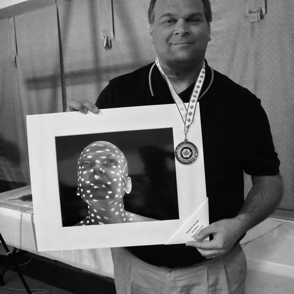
The Crescent Beach Beach Photography Club's Black and White Invitational Print Competition 2009 winner.
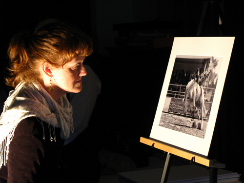
Wendy pondering a print.
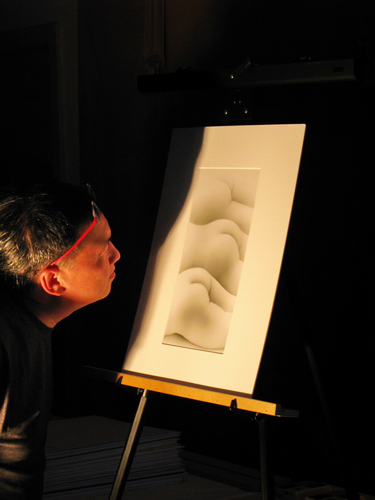
If we could have handed out an honourable mention (only 1st, 2nd & 3rd this year for some reason), this would have been it.
Once again, we are indebted to Brian Wyndham for providing the terrific pictures you see here.