Crescent Beach Photography Club
Black and White Invitational Print Competition
15 May 2008
Click here for Russel Kwan and Wendy Kwan Black and White Fine Art Photography Home Page
We had the very fun privilege of being invited to jury the Crescent Beach Photography Club’s annual Black and White Invitational Print Competition on May 15. The CBPC meets in a hundred year old former orphanage, a perfect venue for one of photography’s most ancient and enduring forms: the black and white print. It was also our great pleasure to serve on the jury with a true elder statesman of photography: Mr Graydon Roberts, who led us with his finely tuned knowledge and wit.
The competition brought together seven local photography clubs, with each club submitting six prints for review for a total of 42 entries. The organizers briefly displayed each entry, giving all of us the “lay of the land”, for which we were very grateful. Then, each entry was re-displayed for formal evaluation. We expected the standard of work to be very high, and we were not disappointed.
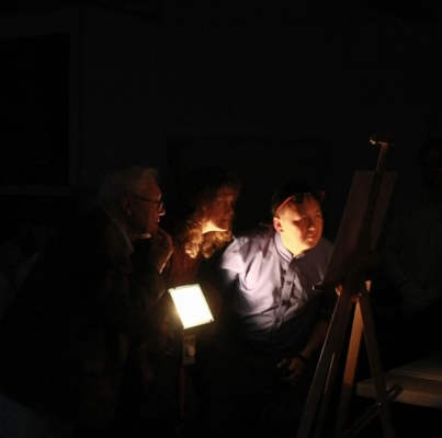
We, the jury, chose to closely examine each print, as we are in the photo to the right. Apparently, this activity caused quite a stir in the audience, and the question “What were you looking for?” came up frequently during the coffee break – a question that, in turn, somewhat surprised me. It finally occurred to me that people rarely confront prints anymore, and that photography mostly exists as 1024x768 pixel projections.
In a way, I feel the ultimate expression of photography lies in the print. One can hold a print. One can choose how to look at a print – from across the room, or from inches away. A print often reveals far more detail than a projection. A print has surface qualities, and can be hung on a wall. Some prints will survive for centuries, with the right care. One needs no special equipment to view a print. And prints provide insight into the skill and care of their creator – which is what I was looking for with the closeup inspections.
Ok, ok – maybe I can’t quite see the love someone has put into a print – but I can see the lack of it. Whenever I’m asked to review prints, I often see the same few recurrent flaws that can fatally break an otherwise fine photograph. With digitally created prints, the common problems are: oversharpening, posterization, unpleasant noise, bad upscaling, and clipping of the tonal range. With optically produced prints, the common problems are: dust, bad enlarger alignment, clipping of the tonal range and weak tonal relationships.
Here’s some simple things you can do to avoid these problems:
Oversharpening: Do sharpening as the last act in your workflow - in particular, after resizing to final print dimensions. View the results of your sharpening at 100% on your monitor. Look at both sharp and nearly-sharp areas, and avoid the telltale bright halo of oversharpening. A more subtle thing to consider: if the photograph was made with shallow depth of field, avoid visible sharpening in areas where the focus has fallen off.
Posterization: Check the histogram of your final file. Does it (or any of its channels) look like a picket fence? Or worse yet: like a hedgehog with spikes sticking up (or down)? Those are signs of posterization. Posterization will look like flat patches of tone or colour in your print – it will tend to make your photograph look less like a photograph and more like a serigraph. Even if your histogram looks ok, make sure your print does, too. Gamut limitations in output devices can cause the same patchiness to occur in prints – because the output device may not be able to reproduce every colour in your file. Look into calibrating and profiling all of your equipment and materials if you are really serious about this – but be aware that even careful profiling has limitations.
Unpleasant noise: At its worst, noise can mask tones and muddy colour. It’s often the most obvious in dark areas, but can occur anywhere. Zoom in on areas that should have clear colours or tones. Are they? To reduce noise, the first choice is a lower ISO setting on your camera. A second choice is noise-reduction software, but be aware that reducing noise with software also reduces detail.
Bad upscaling: This often appears as a case of the “jaggies” – jagged, staircase-like edges instead of smooth curves. Be careful how much upscaling you do – sometimes there just isn’t enough information for a really big print. Use purpose-made upscaling software instead of Photoshop’s resampling feature. Remember: a smooth, detailed small print is way nicer to view than a jaggy, textureless big print.
Clipping of the tonal range: Clipping results in pure black and pure white areas being printed. Sometimes areas of pure black and pure white are desirable – but it takes careful design to make it work. To know if clipping is going on, refer to the histogram again… if there is a spike at either the left or right edge, you have clipping. Fixing clipping may not be such an easy thing. Compositing two “exposures” (one dark and one light) from a single raw file may help reduce clipping. When shooting, sometimes a polarizer can help with hot reflections. Otherwise, try to find another viewpoint with less range of light, or modify the light itself with a reflector, scrim or flash.
Dust: Well, dust is the enemy. In the darkroom, static control measures are the best way to keep dust down – an ionizing air cleaner (available at practically every big pharmacy or Home Depot) works wonders. Religiously clean your negatives before printing – I find cleaning negs preferable to spotting – we don’t ever spot our prints – but we don’t need to, either – there is no dust.
Bad enlarger alignment: Bad alignment causes focus falloff at the edges of a print, making film grain fuzzy, and causes a loss of tonal separation. At worst, prints may look muddy and unsharp near the edges. The enlarger needs to have its negative, lens and paper planes perfectly parallel. It can’t be made parallel enough with a bubble level – you’ll need a more sophisticated tool (we use Zig-Align). The problem gets worse with larger format negatives and larger prints, making alignment even more critical to get the most out of your materials. You can quickly check the focus of a neg at the paper edges with a good grain focuser – we use a Peak 3.
Weak tonal relationships: This results in flat-looking prints where there simply isn’t enough separation in tones, or too-contrasty prints where there aren’t many tones at all. It’s pretty subjective… it’s a good idea to make a few test prints with different contrast settings and exposures – the best combinations are often apparent. Dodging and burning are often necessary to balance out the tones in a print – but use these controls judiciously. There is a hair-thin line between overmanipulation and drama.
I hope these notes might help explain what all that up-close inspection was about, and I hope you might have found these suggestions helpful in your future work.
Our thanks again to the Crescent Beach Photography Club for hosting a wonderful event, and to Brian Wyndham, who photographically documented it so well.